The Rainbow's Secret

Colour Theory For Watercolour!
Hello, fellow watercolour wizards! 🌈🎨
Welcome back to another exciting chapter in our journey through the vibrant world of watercolour painting! So far, we’ve dabbled in techniques like negative space, lifting paint, and embracing the unpredictability of water. Today, we’re diving into a topic that will help you unlock a whole new realm of creativity: colour theory!
Now, before you start groaning and thinking this sounds too much like school, let me assure you: colour theory is like the secret recipe to a delicious painting. Understanding how colours work together can transform your artwork from good to extraordinary! So, grab your brushes and let’s explore the enchanting world of colours!
What is Colour Theory?
At its core colour theory is the study of how colours interact with one another and how they can be combined to create harmonious and visually appealing compositions. It’s the foundation for creating stunning artwork and in watercolour, it can help you understand how to mix, layer, and balance colours to achieve the effects you want.
Here are a few key concepts in colour theory that every watercolour artist should know:
- The Colour Wheel

The colour wheel is a visual representation of colours arranged in a circle. It’s a fantastic tool for understanding how colours relate to each other. Here are the main categories:
- Primary Colours: Red, yellow, and blue. These colours cannot be created by mixing others.
- Secondary Colours: Green, orange, and purple. These are made by mixing two primary colours.
- Tertiary Colours: These are created by mixing a primary colour with a secondary colour, resulting in hues like red-orange or blue-green.
By understanding the colour wheel, you can start to see how colours work together and how to create new shades.
2. Complementary Colours
Complementary colours are opposite each other on the colour wheel. For example, red is complementary to green, blue to orange, and yellow to purple. These colours create strong contrast and vibrancy when placed side by side, making them perfect for creating focal points in your paintings.
Pro tip: When mixing complementary colours, remember that they can neutralise each other. Mixing a little of one into the other will create muted tones which is great for shadows or backgrounds!
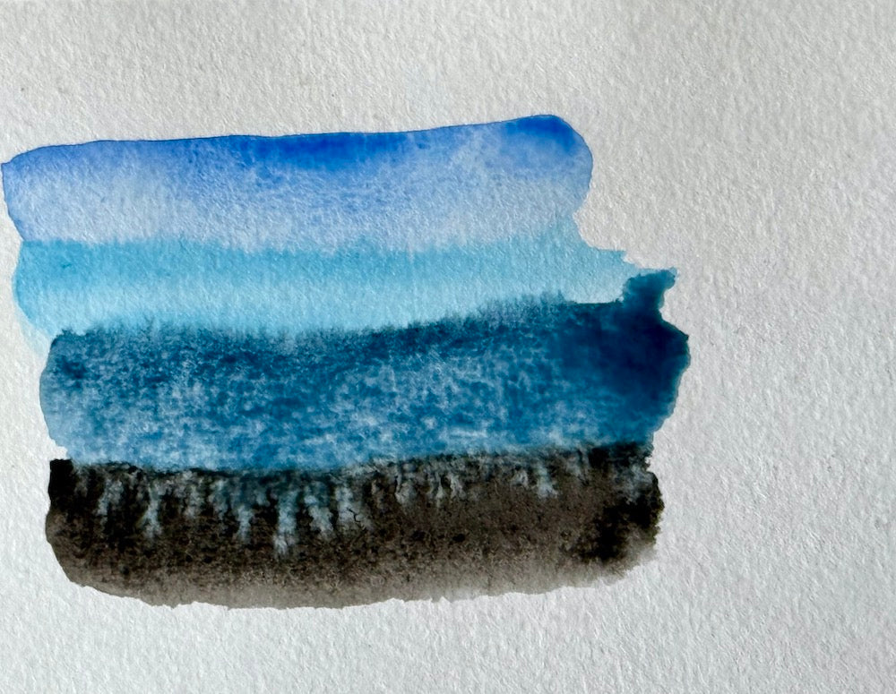
Mixing Your Own Colours: The Art of Colour Harmony
One of the best things about watercolour is how easily you can mix your own colours to achieve the perfect hue for your painting. But with great power comes great responsibility! Here’s how to mix colours effectively and create harmonious palettes:
1. Start with a Limited Palette
When you’re starting out, it’s a good idea to stick to a limited colour palette. This helps you understand how to mix colours and prevents your painting from becoming too chaotic. A basic palette might include:
- A warm red (like cadmium red)
- A cool red (like alizarin crimson)
- A warm yellow (like cadmium yellow)
- A cool yellow (like lemon yellow)
- A warm blue (like ultramarine blue)
- A cool blue (like cerulean blue)
With just these six colours, you can create a vast range of beautiful hues!
2. Experiment with Mixing
Don’t be afraid to get messy! Start mixing your primary colours to create secondary and tertiary colours. Make notes of your mixes and how they turn out, so you can recreate your favourite hues later.
Pro tip: Try creating a colour chart by mixing different proportions of your primary colours. This will give you a handy reference for future projects!
Creating Mood with Colour: The Emotional Impact of Hues
Did you know that colours can evoke emotions and set the mood in your paintings? Understanding the emotional impact of different colours can help you convey the feelings you want to express in your artwork. Here’s a quick breakdown:
-
Warm Colours (Red, Orange, Yellow): These colours are energetic and vibrant. They can create feelings of warmth, excitement, and happiness. Use them to make your paintings feel alive!
-
Cool Colours (Blue, Green, Purple): Cool colours are calming and soothing. They can evoke feelings of peace, tranquility, and reflection. Perfect for serene landscapes or soft backgrounds.
-
Neutral Colours (Greys, Browns, Whites): Neutrals can ground your painting and create balance. They can also provide contrast to more vibrant colours.
Think about the mood you want to convey in your painting, and choose your colours accordingly!

Practical Exercises: Colour Mixing and Mood Exploration
Ready to put your new knowledge into practice? Here are a couple of fun exercises to help you explore colour mixing and the emotional impact of hues.
Exercise 1: Colour Mixing Chart
-
Set up a colour mixing chart. On a piece of watercolour paper, create a grid to document your colour mixes.
-
Mix different colours. Start with your primary colours and create secondary and tertiary hues. Write down the ratios of each colour used to create the new shade.
-
Label the emotional impact. Next to each mix, note how the colour makes you feel or the mood it conveys.
Exercise 2: Mood Painting

-
Choose a theme or emotion. Think about a specific feeling you want to express—joy, tranquility, mystery, etc.
-
Select your colour palette. Based on your chosen emotion, pick colours that align with that mood.
-
Create a quick painting. Use your chosen colours to paint an abstract piece that reflects the emotion. Allow yourself to be free and expressive!
Final Thoughts: Colour Is Your Superpower
Understanding colour theory isn’t just about knowing what colours look good together, it’s about discovering how to express yourself through your art. Colour can set the mood, create depth, and guide the viewer’s eye through your painting.
Next time you pick up your brush, think about the colours you’re using and how they interact with each other. Embrace the magic of mixing, layering, and letting your personality shine through your palette!
If you enjoyed exploring colour theory and want to see how I incorporate these principles into my own watercolour work, be sure to visit Jules Smith Art here at my gallery and explore my latest creations. And don’t forget to follow me on Instagram @julessmithshots for more updates on my artistic journey.
Happy painting, and remember, your palette is your playground!
Join me next week for The Luminescence of Layering!