The Magic of Negative Space

Letting Your Watercolour Breathe
Hello again, my lovely watercolourists! 🎨✨
You’ve made it this far, which means you’re well on your way to becoming a master of this beautifully unpredictable medium. Today we’re talking about a technique that can truly elevate your paintings from “nice” to “wow!” The art of negative space.
Now, before you panic and think this involves math or something complicated, let me reassure you: negative space is just the skill of letting your painting breathe. It's the space you don’t paint—the gaps, the empty areas, the untouched paper. Sounds simple, right? But using negative space strategically can give your paintings a whole new level of depth, clarity, and intrigue. So grab your brushes and let’s explore the magic of negative space.

What Is Negative Space?
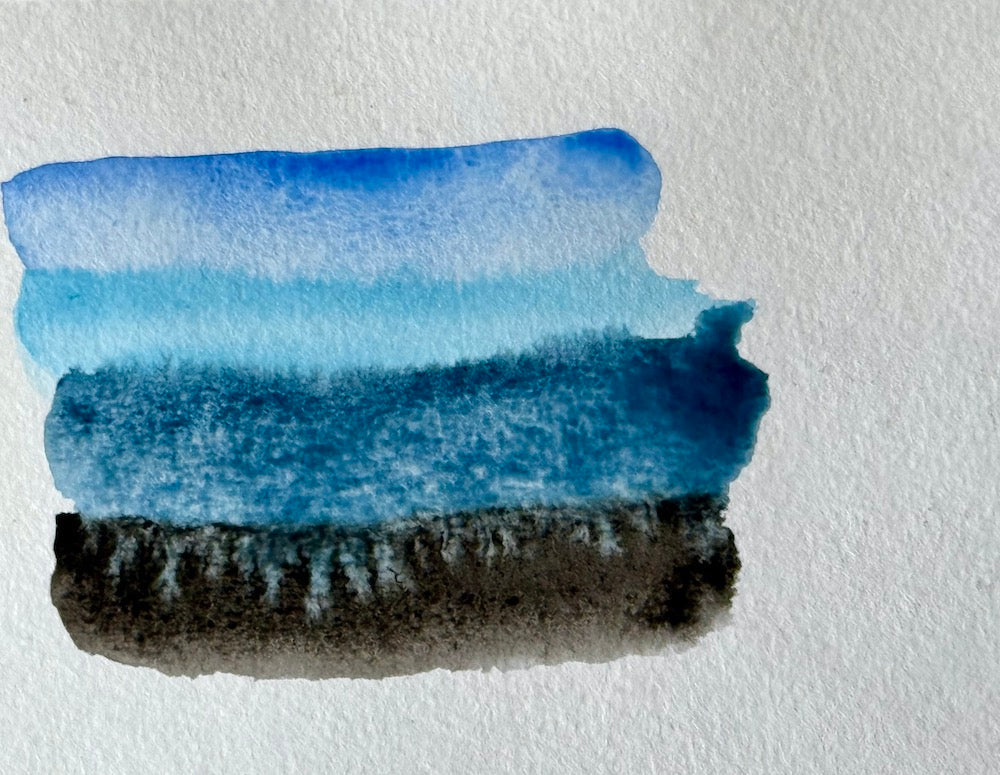
Negative space is the empty or open space around and between the subject of your painting. It’s the "nothingness" that defines the "something." Sounds deep, I know. But in art, what you leave out can be just as important as what you put in.
In watercolour, where the medium naturally lends itself to transparency and lightness, negative space can be your best friend. Instead of filling every inch of your paper with paint you can allow areas of white or lighter colours to remain, giving your painting a sense of airiness and letting your subject pop off the page.
Think of it like this: the paint says “Here I am!” and the negative space says, “Look, I’m highlighting the best parts.”
Why Negative Space is Powerful in Watercolour
Watercolour is a light, transparent medium. When you layer too much paint or try to cover the entire surface, things can get heavy or muddy. Negative space gives your eyes a place to rest and makes your subject more pronounced, and creates a sense of balance in your composition.
Here are a few reasons why embracing negative space is a game-changer:
-
Focus: Negative space directs attention to your subject. By leaving areas of the paper untouched, you make the painted parts stand out more.
-
Depth: Negative space adds depth without requiring complicated shading or layering techniques. The contrast between painted and unpainted areas automatically creates a sense of dimension.
-
Light: Watercolour is all about light and negative space allows the natural brightness of the paper to shine through, giving your painting a glowing quality.
-
Simplicity: Less is more! Negative space helps you create cleaner, simpler compositions that feel effortless and fresh.
How to Use Negative Space Effectively
Now that we’ve covered why negative space is so important, let’s talk about how to actually use it in your painting. Here are some tips to get you started:
1. Plan Your Composition
Before you start slapping paint on the page, take a moment to consider the composition of your painting. Think about where your subject is going to be and where you want to leave areas of unpainted paper.
Pro tip: If you’re unsure about your composition, lightly sketch out your subject and surrounding negative spaces with a pencil. This will give you a roadmap to follow as you paint.
2. Don’t Be Afraid to Leave White
One of the biggest challenges for beginners is resisting the urge to fill in every corner of the paper with paint. But trust me—leaving white space isn’t “unfinished.” It’s deliberate, and it can make your painting sing.
When planning your composition, be intentional about where you leave white or unpainted areas. Let those spaces work for you.
3. Use Negative Space to Define Your Subject
One of the coolest things about negative space is that it can define the shape of your subject without you having to paint every detail. For example, instead of painting every individual petal of a flower, you can paint the spaces around the petals, letting the unpainted paper create the flower’s shape.
This technique can create a much more interesting and abstract feel, especially if you’re going for a loose, impressionistic style.
4. Try the Wet-on-Dry Technique for Precision
When working with negative space, you might want sharper, cleaner edges. This is where the wet-on-dry technique comes in handy. By applying wet paint onto dry paper, you’ll have more control over your brushstrokes and can create crisp lines that contrast beautifully with your unpainted spaces.
Negative Space in Action: Simple Exercises
Want to try your hand at using negative space in your own work? Here are a couple of simple exercises that will help you get comfortable with the concept.

Exercise 1: The Leaf Outline
-
Draw a simple leaf shape. Lightly sketch out the outline of a leaf (or any other simple shape) in pencil.
-
Paint around the shape. Instead of filling in the leaf with colour, paint the area around it. Let the negative space define the leaf’s shape. You’ll notice that the untouched paper creates a natural highlight.
-
Layer and refine. Once the background is dry, you can add more layers around the leaf to enhance the depth of the negative space or leave it as is for a minimalist look.
Exercise 2: Negative Space Still Life
 Set up a simple still life. Choose an object like a mug, a plant, or a fruit. Lightly sketch the object, paying attention to the spaces around it as much as the object itself.
-
-
Paint the negative space. Instead of focusing on painting the object, paint the spaces around the object. This will naturally highlight and define the subject through contrast.
-
Keep it loose. Don’t worry about perfect lines or details—this exercise is all about letting the negative space do the heavy lifting!
Embracing Negative Space in Abstract Work
If you’re an abstract painter (and if you’ve been following my blog, you know how much I love abstract painting), negative space becomes even more powerful. You can use unpainted areas to create tension, balance, or rhythm in your work.
Tip for Abstract Painting: Balance Is Key
-
Paint the negative space. Instead of focusing on painting the object, paint the spaces around the object. This will naturally highlight and define the subject through contrast.

In abstract compositions, too much negative space can make the painting feel unfinished, while too little can feel chaotic. The trick is finding that sweet spot where the painted and unpainted areas complement each other.
Pro tip: As you paint, step back and squint at your work. This will help you see the larger composition and balance of the painting without getting bogged down by small details.
Final Thoughts: Less Can Be More
Negative space might feel a bit counterintuitive at first. After all, we usually think of painting as the act of adding colour, not leaving areas untouched. But learning to embrace those untouched spaces is a game-changer in watercolour. It creates balance, depth, and clarity—and lets your painting breathe.
So next time you sit down with your watercolours, resist the urge to fill every inch of the page. Instead, think about what you can leave out. Trust me, your painting will thank you for it.
If you’ve enjoyed this little exploration into the magic of negative space, make sure to check out my own work here at Jules Smith Art, where I play with this technique in many of my abstract and impressionistic pieces. You can also find watercolours available for sale that highlight the beauty of what isn’t painted, as much as what is.
And, of course, don’t forget to follow me on Instagram @julessmithshots for more paintings and behind-the-scenes looks at my latest watercolour creations.
Keep painting, and remember—sometimes what you don’t paint is just as powerful as what you do. 💫
Join me next week for Colour Theory!